McLaren Brand Identity Update: A Controversial Shift Toward Corporate Minimalism
 Marcus Vance
4 minutes read
Marcus Vance
4 minutes read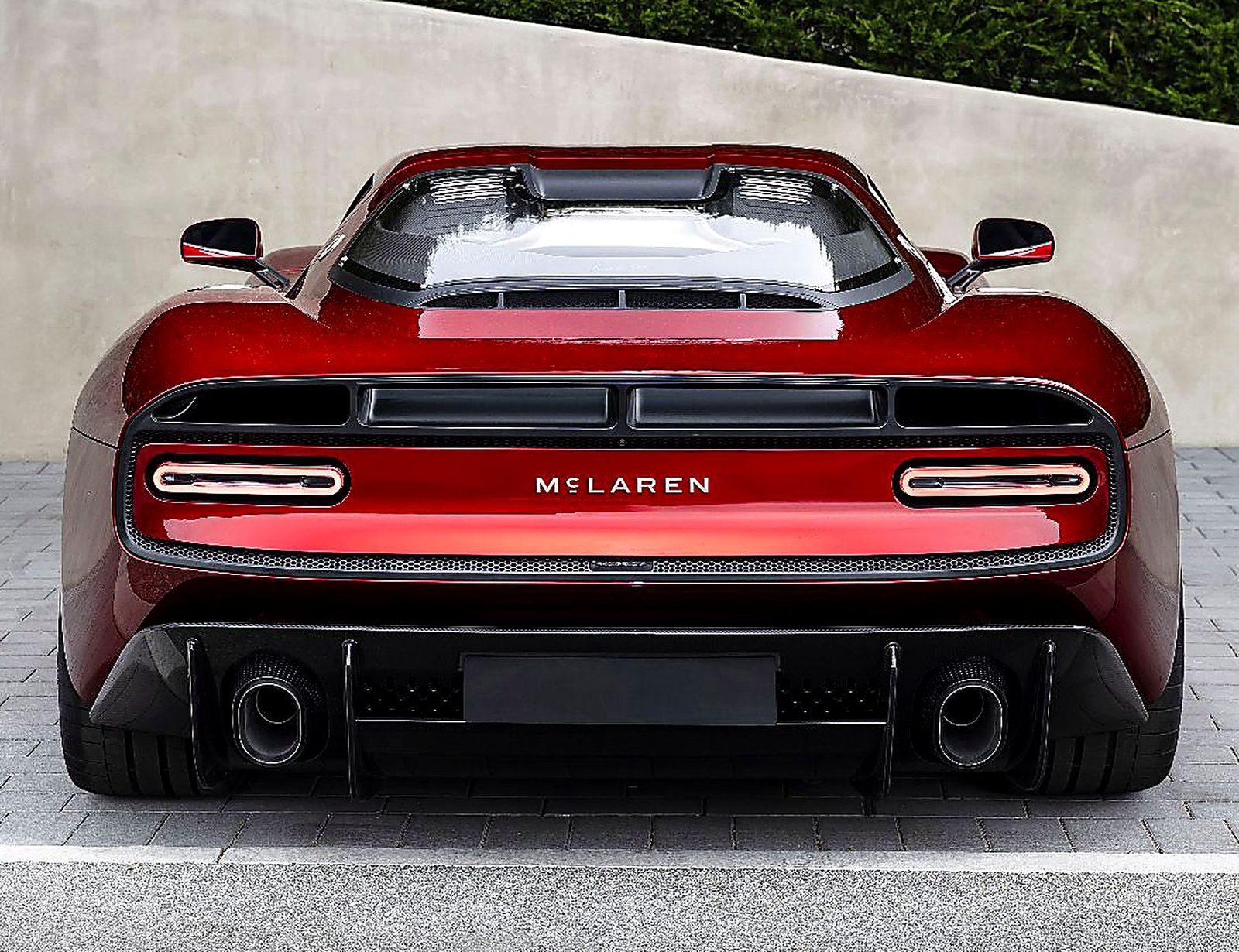
| 🚀 Key Takeaways: • The McLaren Brand Identity Update introduces a new block-letter wordmark for the company. • Inspired by the original Remuera service station, it anchors the brand to Bruce McLaren’s heritage. • While the Speedmark emblem remains, the brand signals a new chapter for 2026 and beyond. |
Automotive purity is a rare commodity in today’s landscape of electrification and focus-grouped design. Recently, Woking decided it was time for a change, unveiling a significant McLaren Brand Identity Update meant to bridge the gap between its humble beginnings and a high-tech future. For those of us who live for the mechanical scream of a 4.0-liter twin-turbo V8, the prospect of a new logo feels secondary to the chassis dynamics underneath.
The Evolution of the McLaren Brand Identity Update
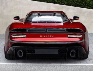
Historically, this British powerhouse has focused on carbon fiber monocoque perfection rather than font kerning. Nevertheless, the new wordmark features bold, uppercase letters with a lowercase, underlined “c” that feels more akin to a high-end fashion label than a track-focused engineering firm. According to McLaren Automotive, this evolution draws a direct line to the service station where Bruce McLaren first honed his craft.
Consequently, the shift attempts to marry vintage roots with modern ambition. While the previous logo utilized an angled “M” that suggested constant motion, this new iteration is undeniably static and blocky. In my professional estimation, it lacks the visceral aggression that a 750S communicates when it’s biting into an apex at full tilt. Does it signal a watered-down future, or simply a necessary corporate maturation?
| ⚙️Engine / Powertrain | 4.0L Twin-Turbo V8 |
| 🐎Power Output | 777 HP |
| ⚡Peak Torque | 590 lb-ft |
| ⏱️0-60 mph (0-100 km/h) | 0-60 mph in 2.7s |
| 🚀Top Speed | 212 mph |
| 🔄Drivetrain / Gearbox | 7-Speed Dual-Clutch / RWD |
| 💰Starting Price / Est. | $380,000 (est.) |
Furthermore, the company is doubling down on its signature Papaya orange and the iconic Speedy Kiwi emblem to maintain some semblance of its storied past. Whether this visual change will influence the driving dynamics of upcoming projects like the McL 6GT remains to be seen. Meanwhile, rumor persists that a new hybrid-V8 SUV is currently in the works, a move that would have been heresy in the days of the F1.
Competitor Analysis: A Shift in Market Strategy
Specifically, when we compare this brand evolution to the likes of Ferrari or Porsche, the stakes become clear. Ferrari remains tethered to the Prancing Horse, a symbol so powerful it requires no text. Conversely, Porsche leans into its Stuttgart crest, focusing on the engineering lineage of the 911 rather than playing with typography. McLaren is attempting to find a similar level of global brand recognition.
In fact, this change occurs as L’IMAD invests a staggering $668 million to overhaul manufacturing facilities. While Stuttgart and Maranello have spent decades building luxury retail empires, McLaren is finally playing catch-up. Ultimately, a brand is only as strong as its latest lap time, regardless of what the badge looks like on the decklid.
Pricing, Available Trims, and Ownership Value
Regarding the current lineup, the 788HS stands as the ultimate swan song for the 720S platform. Pricing for these limited-run machines is astronomical, often exceeding $350,000 depending on bespoke options. Furthermore, standard warranty coverage typically sits at a 3-Year/Unlimited Mile structure, which is standard for the exotic segment. If you are shopping for a used MP4-12C or 570S, expect insurance premiums to reflect the high cost of carbon-tub repairs. For more insights on the latest tech, check out Auto News Magazine for a deeper dive into modern supercar maintenance.
Future Speculation: Collector Status
Predicting collector value is a fool’s errand, yet I suspect early models with the “old” logo will eventually carry a premium among purists. Specifically, the McL 6GT represents the next phase of this identity. If the manual gearbox rumors prove true, that car will become an instant classic, regardless of the font used on its badge. I expect this McLaren Brand Identity Update to be a footnote in history, while the engineering excellence remains the headline.
Conclusion
Ultimately, a logo is just a sticker on a masterpiece of engineering. Whether you love the new, blocky wordmark or prefer the older, more dynamic script, the reality remains unchanged. McLaren is a firm that lives and dies by its ability to extract unflinching lateral Gs from a chassis. As long as they keep building machines that make your heart race, they can paint the logo in neon pink for all I care.
Marcus Vance
Senior Track & Performance Editor at Auto News Magazine. Veteran automotive journalist specializing in chassis dynamics, apex telemetry, track-day specials, and high-revving mechanical purity.
View all articles by Marcus Vance →